Camp Feral!
As a volunteer with Camp Feral! Art Events, I directed a comprehensive website redesign initiative encompassing a strategic branding refresh, implementation of custom CSS on their WordPress platform, and optimization of information architecture to significantly improve user experience and navigational efficiency.

Background
Camp Feral! Arts Events is a nonprofit organization that hosts an annual adults-only furry camping convention in Algonquin Park. Attendees enjoy a traditional convention experience featuring panels, workshops, and dances, while also participating in classic camp activities such as canoeing, archery, and capture the flag. The organization creates an immersive narrative experience based on each year’s theme, which has included concepts ranging from horror, B-movies and retro-futurism to more abstract ideas like [insert theme here].
Challenges
Brand Identity
Visitors frequently experienced ambiguity regarding the event’s purpose and the website’s intended function, leading to sub-optimal user engagement.
Information Architecture
Attendees frequently submitted tickets with basic, easily answerable questions through the ticketing system. These same questions often appeared in public social chat groups, where other attendees would respond before staff could—sometimes with inaccurate information. Both scenarios created unnecessary additional work for the staff.

Analysis
Brand Identity
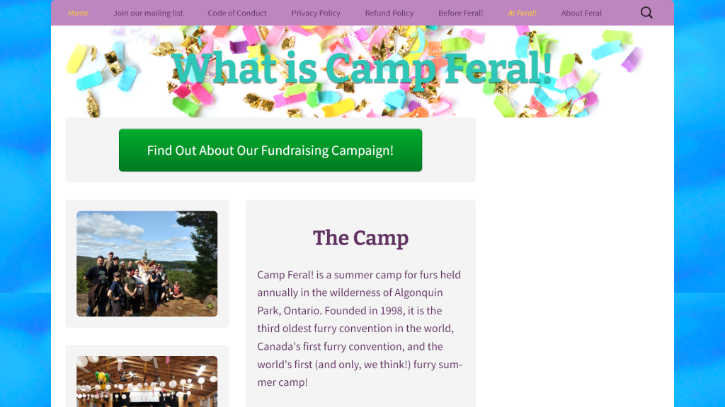
- Although Camp Feral had established brand colors and a logo, they styled their website based on each year’s theme rather than maintaining consistent branding. This created confusion for visitors who couldn’t clearly identify the organization or its purpose.
- The inconsistency extended further, with noticeable visual disconnects between their website, e-newsletters, and social media accounts.
- The website’s color scheme lacked sufficient contrast, making text difficult to read and compromising accessibility.
Information Architecture
- The site navigation featured ambiguous menu items that didn’t align with common expectations for event websites.
- Critical information was missing, difficult to locate, or outdated.
- Information pages contained long, difficult-to-scan paragraphs of text.
Accessibility
- Some text is did not have enough contrast with the background, making readability difficult.

Solution
Brand Identity
- Developed a comprehensive branding guide and implemented it across the website.
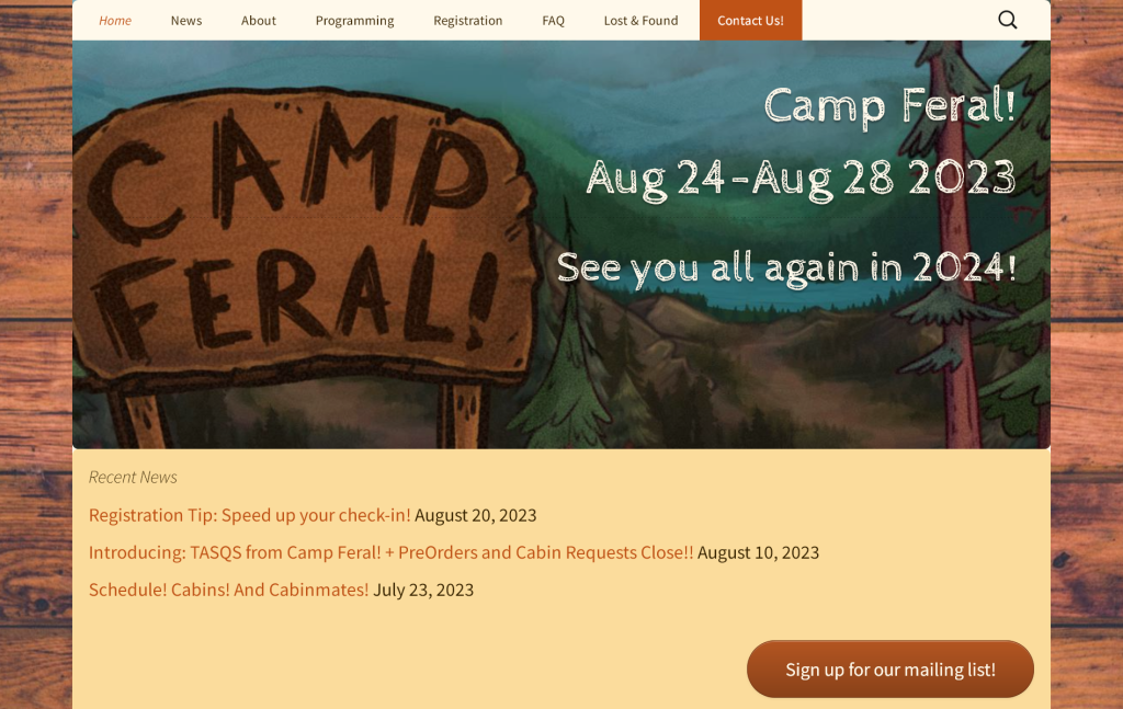
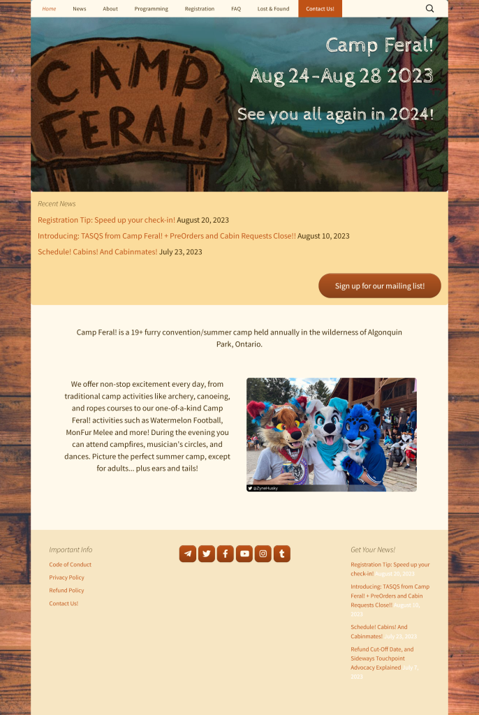
For the brand and site design, I aimed to evoke nostalgia, fun, and an authentic outdoor camp feeling. Feral needed to convey professionalism while maintaining a playful, lighthearted tone.- The color scheme and wood textures evoked the feeling of nature.
- The full-image background with a fixed-width content area referenced 90s/early 2000s website design, creating a nostalgic atmosphere.
- Playful font choices enhanced the fun, casual vibe.
- For visual elements, our staff artist created a new hero banner while I updated the photography with credited images from attendees.
- Created a dedicated page to showcase each year’s theme and narrative, allowing it to have independent branding from the main site.
- Ensured that text/backgrounds were high contrast.
Information Architecture
- Implemented a new navigation menu.
- Updated outdated information.
- Added new pages to cover missing information.
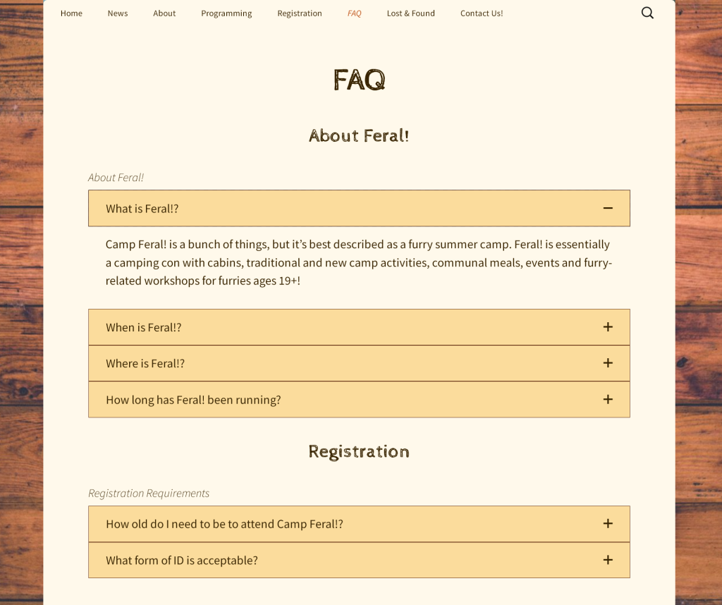
- Added an FAQ to cover common questions and miscellaneous information.
- Added a hero banner displaying event dates and a clear call to action (e.g., “Register Now”).
- Incorporated a news feed to provide timely updates.

Results
- Information request tickets decreased significantly after the redesign.
- Attendees began sharing links to the new pages and FAQ sections when answering questions from others, which helped ensure the accuracy of information being shared.