Red Dragon Games
During my media project management course, I participated in a team-based website redesign project. Our academic assignment required us to select an existing commercial website and improve its user experience. We accomplished this through research, analysis, and the development of wire-frames. Note that this was an educational exercise and did not involve collaboration with the actual business.
Background
Red Dragon is a local hobby shop in Orleans, Ottawa, that sells trading card games, board games, models, and more. They host gaming events almost daily in-store and tournaments on weekends.
Challenge
According to a team member who regularly visits Red Dragon, the store enjoys an excellent reputation for its knowledgeable in-store staff, but customers lose confidence when shopping on their website.
Analysis
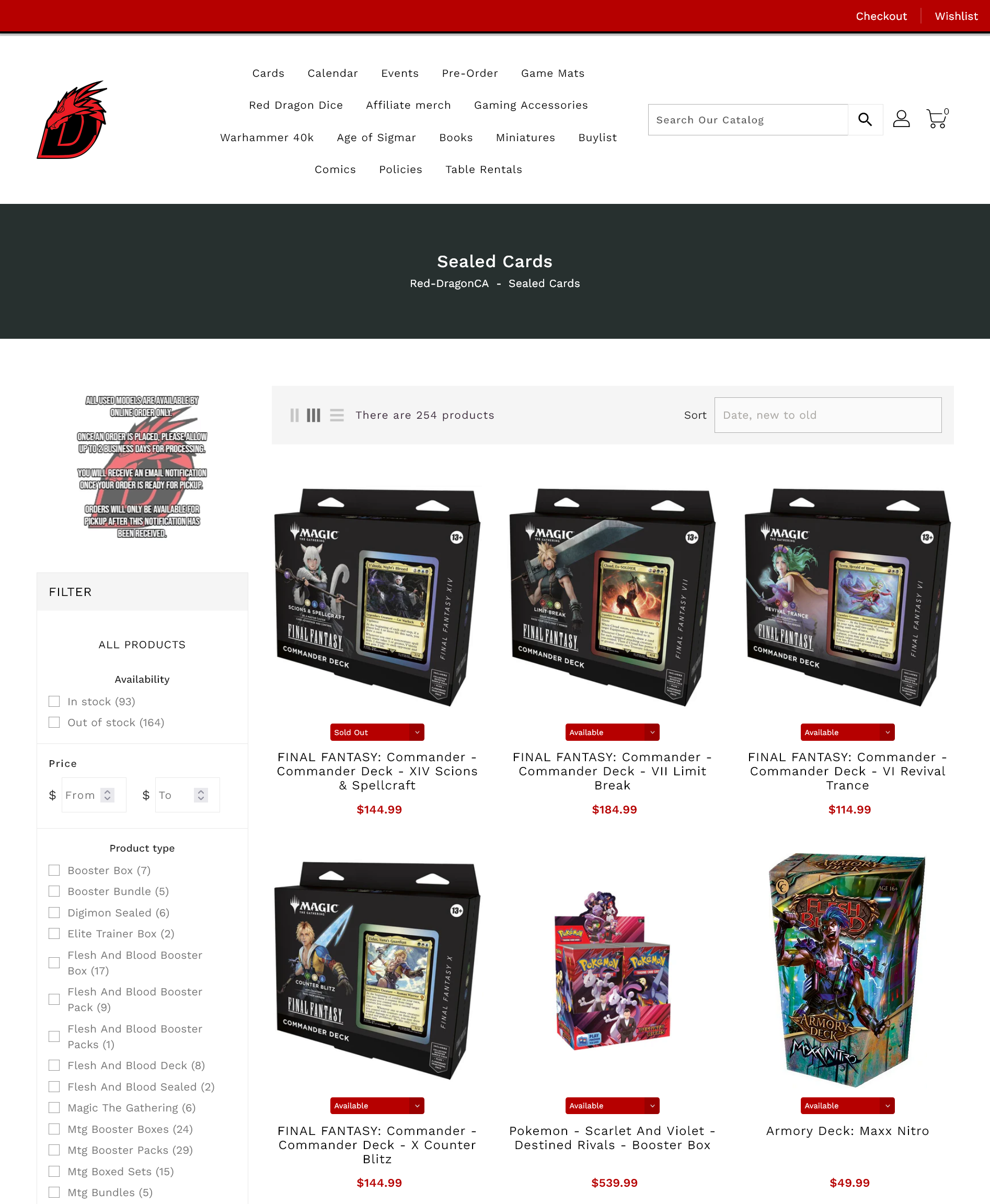
Tabletop games like Magic the Gathering and Warhammer are complex, with numerous product categories and subcategories. Seasoned hobbyists who know exactly what they’re looking for might navigate successfully, but the site’s organization isn’t intuitive for newcomers who may only know a game title and product name.
Information Architecture
- The store lacks a unified product page, instead placing various product categories directly in the top-level navigation menu.
- Navigation menu organization is inconsistent, mixing categorization approaches—some items are grouped by product type (cards, models), while others by game title (Warhammer 40k, Age of Sigmar).
- Products often appear without clear connection to their respective games or are labeled with abbreviations that new customers wouldn’t understand without prior knowledge.

Solution
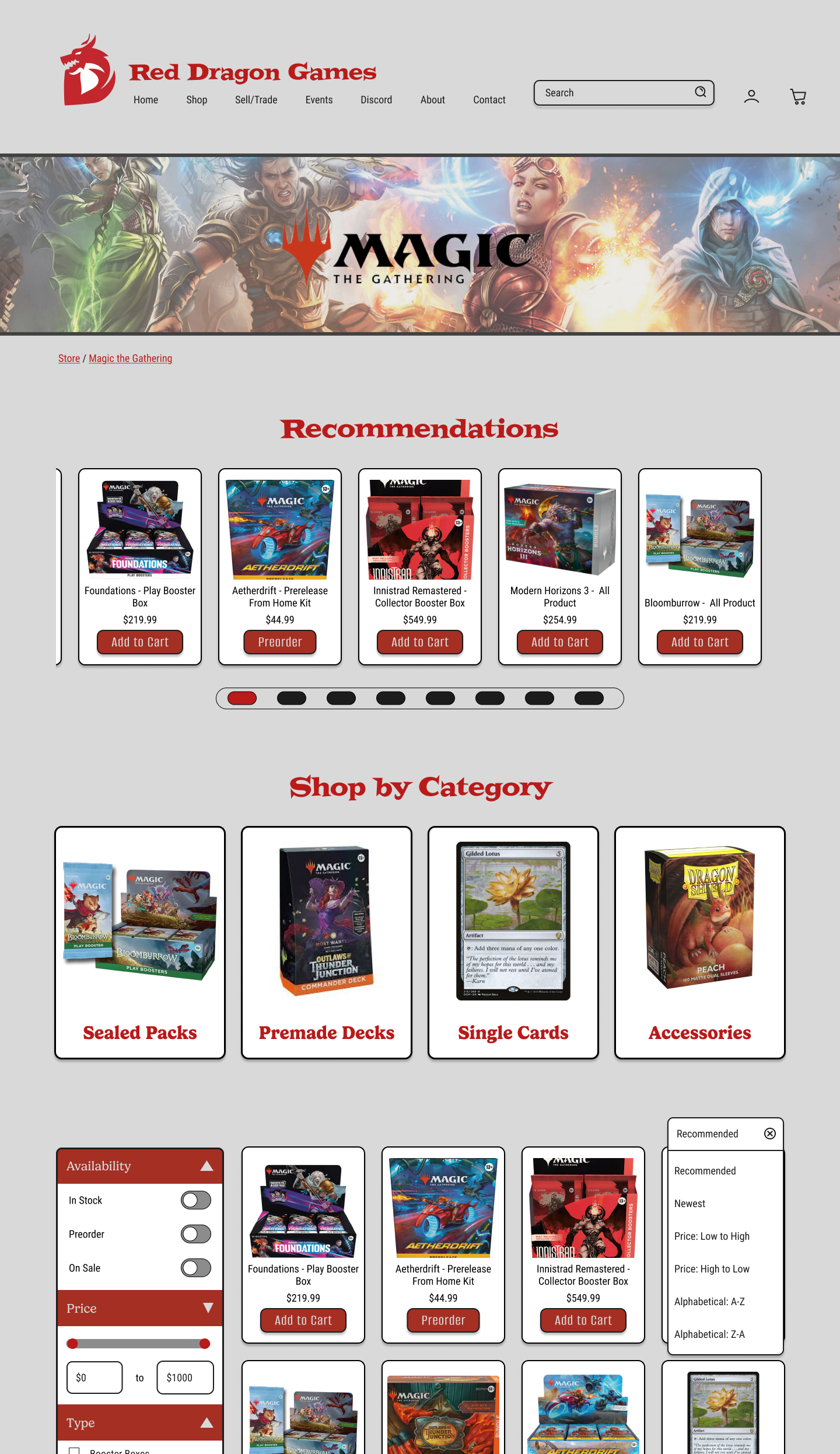
- Create a streamlined navigation menu with a single ‘Store’ entry point.
- Organize products hierarchically—first by game title (Magic the Gathering, Warhammer, etc.), then by intuitive product categories using clear, descriptive terms (e.g., Sealed Packs, Pre-made Decks).
- Enhance visual recognition by adding product images alongside game titles and product categories.
- Include featured recommendations for visitors who know they want something popular but haven’t decided on a specific product.
Design Decisions
- With the name Red Dragon, we chose to stick to a colour palette of reds and neutrals.
- The team had decided on a grey colour for the website background. While the text contrast is acceptable for large headings, I chose to place the product details and store filters inside cards with a white background to ensure that important information was clear and readable.
- Gelica was chosen for large heading fonts as a way to invoke a sense of fun with a touch of fantasy, supplemented with Roboto sans serif for the main page text for readability and professionalism.
Contributions to the Project
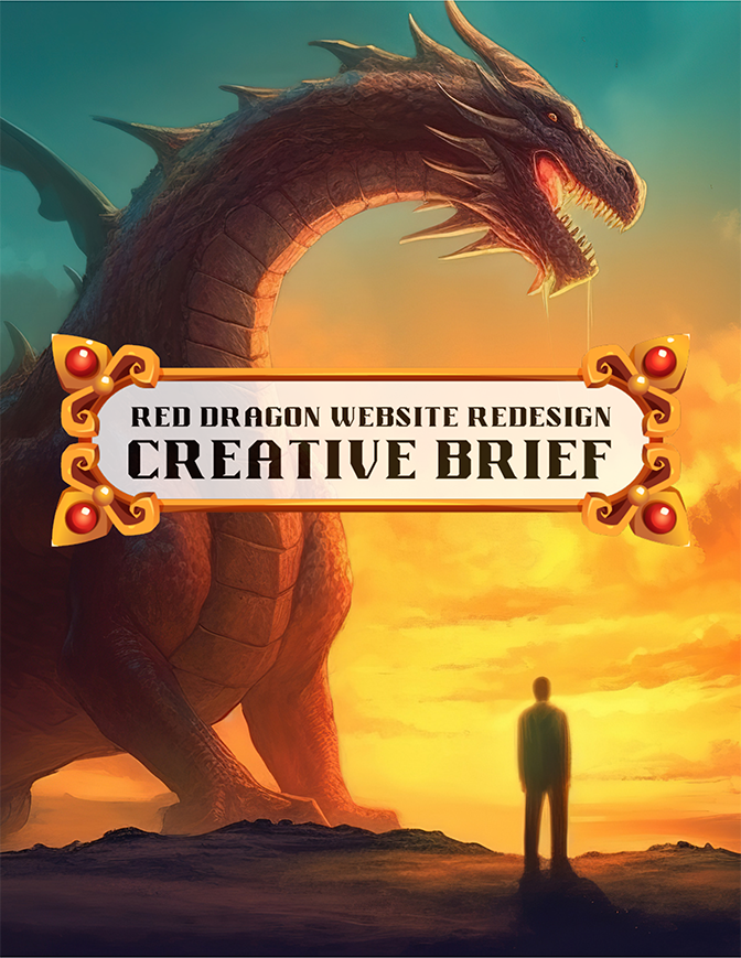
Red Dragon Creative Brief
Designed with Canva, this creative brief design aims to capture the aesthetic and feel of a Dungeons & Dragons rule book.
Art/Graphics are from www.vecteezy.com
Pokemon, Warhammer, and Magic the Gathering art owned by their respective companies.
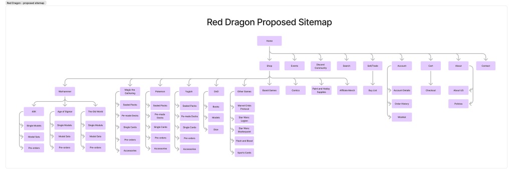
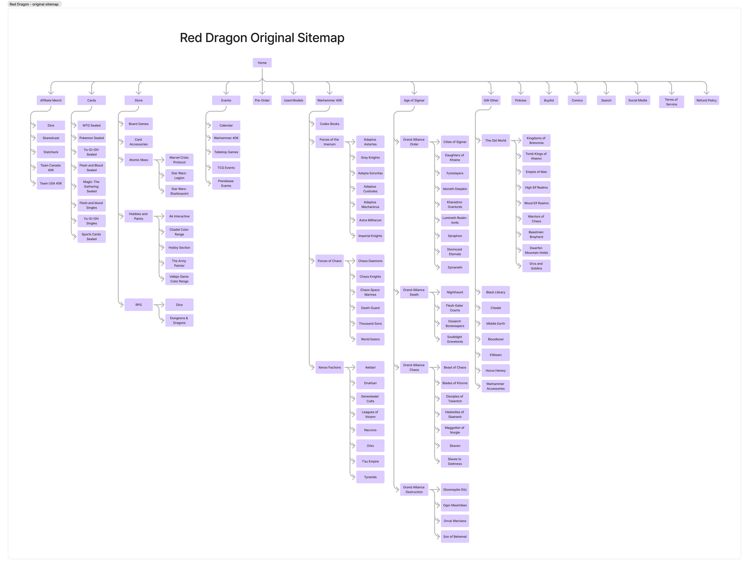
Sitemaps
Developed a visual representation of the website’s current architecture and designed a streamlined sitemap for the proposed redesign.
Created using Figjam
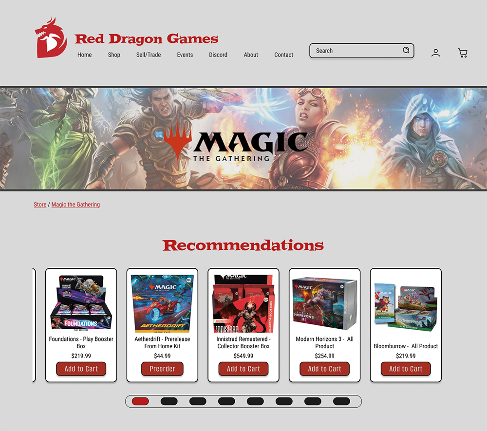
Game Product Page
Designed and created both medium-fidelity and high-fidelity wireframes in Figma, aligning with the approved moodboard specifications.
Magic the Gathering art owned by Wizards of the Coast.